Tuesday 14 December 2010

Stages of Creating my Music Magazine Double Page Spread


1.
Firstly I chose an image to have as a background for the double page spread. I chose this image as it is of both models and there is room to insert text and other images without drawing attention away from them.

2.
I then inserted the title, I used a large white font. I used a black shape behind the text to make sure the title stood out against its busy background but reduced the opacity.

3.
Then I inserted some of the other images I took for the magazine. I mounted the images on a black rectangle as I was worried they would not stand out because the photos have the same background. Again, I reduced the opacity.

4.
After this I inserted two white rectangles which I would later on insert the article over. I reduced the opacity of the shapes.

5.
I then inserted thes speech marks for a quotation I would later on insert. As well as this I added 'watch the behind-the-scenes online at swag-mag.com to remind readers of SWAG's multi-media platforms.

Double Page Spread Flat Plan

Sunday 12 December 2010

Stages of Creating my Music Magazine Contents Page

1.
I chose this image as the model was standing on the right hand side of the photo which would allow me to list my features on the left. Having chose my background image I inserted the title and branding. I contined the bright colour scheme used for the front colour. I used a larger font for the title in order for it to stand out.

2.
I then inserted the date, features and page numbers. I used a bright green for the titles to ensure the readers eye would be drawn to them as it is not used elsewhere on the page. I used to a different colour to the surrounding text when using the word 'swag' as it the brand name. 

3.

Wednesday 8 December 2010

Alterations to Front Cover

First Draft:
This was the first draft of the front cover of my music magazine. Although I am pleased with the result there are elements which I feel I could improve upon. 
Firstly, I am not happy with the date of the issue, as it looks out of place. I think the date would be better suited rotated 90 degrees and placed alongside the G of the title. 

Second Draft:
I have moved the date of the issue as planned and am now much happier with this feature.
However, I still feel that the overall look of the cover could still be improved. The majority of the text is a very light shade of yellow although this shade works well against the darker areas of the image it does not stand out very well against a lot of the white. I think the cover would look better if some of the text was in a bolder colour.

Final Draft:
Having experimented with various colours I have decided to use the same as the title. I feel this colour and the yellow really compliment eachother. The pink stands out much more and is more eye-catching. I also think it gives the cover a more professional look.


Tuesday 7 December 2010

Stages of Creating my Music Magazine Front Cover

1.
Firstly, I chose the image which I would use for my front cover. I chose this photo as although the model is not making eye contact with the audience he is smiling/laughing in order to establish a relationship with them. He looks relaxed and confident.
2.
I then inserted my title. I used ‘Impact’ which is quite a simple font but still striking. I used a bright pink for the title which really stands out against the background. I used a drop shadow to make the title more striking and look less flat.

3. 
The title was covering the model’s face so I used the ‘rubber’ tool to rub out the title which was block his face. It now looks like the model is standing in front of the title, I am pleased with the results.

4.
I then inserted the date of the issue, the barcode, the price and the magazine’s website. I used a drop shadow on the text.

5.
Finally I inserted the puffs. I am pleased with layout however I think the colour of the font could be improved. This shade of yellow does not stand out as much as I had hoped. I will most likely replace the yellow with a colour that stands out more. I used a drop shadow on all of the text and on the lines above and below ‘Charm’.

Saturday 27 November 2010

Edited Photographs for Music Magazine


Unedited Photographs for Music Magazine

These are my original, unedited versions of my photographs for my music magazine. I will not be using these photos as they are not striking enough and would not stand out in a magazine. I will improve these photos by editing them on iPhoto.
___________________________________________________________

The model is not standing up straight which makes the photograph look wonky, I will straighten the image fix this. I will also increase the contrast and exposure to create a bolder photo.

I would crop this photo so that the model is in the centre of the frame as he is the main focus of the image. I will also increase the contrast and exposure like I did in the previous photo to make the photo more striking. As well as this I will 'boost' the colour for a similar effect. 

I will crop this image so that the model is further towards the right hand side of the frame and straighten it as the photograph is at a slight angle. Again, I will 'boost' the colour, increase the contrast and increase the exposure of the image.

I do not like the writing above the main section of graffiti so I will crop this photograph to remove this section of the image. I will also straighten the image as the model looks like he is standing at an angle. I will also 'boost' the colour and increase the contrast and the exposure of the photo. 


I am  happy with the scale and layout of this photo so I will not crop or straighten it. However I will still need to increase the contrast and exposure of the image and 'boost' the colours to make it more striking.

Again, I am happy with the scale and layout of this photo so I will not need to edit this image by cropping or straightening it. I will also increase the contrast and exposure of the image. I will not 'boost' the colours of this photo.


I would like the models to be in the centre of the image so I will crop my photo, I will then straighten it.  will also make the photo more striking by adjusting the contrast and exposure of the photograph. As well as this I will use the 'boost' colour tool on iPhoto. 


I will 'boost' the colour of this photo and increase the contrast and exposure of the image. 

Tuesday 23 November 2010

Location for Photo Shoot


After careful consideration I have decided to take the photos for my magazine down a small alley near Chalkwell Station in Southend-on-Sea.
I have chosen this location having decided the photos should be taken in an urban location. This led me to look for locations with graffiti that could be used as a backdrop to the photographs. 
The graffiti covered walls and urban setting of the alley are perfectly suited for the photo shot and  very appropriate for SWAG's genre and audience.

Monday 22 November 2010

Reader Profile

SWAG Magazine
SWAG readers are affluent, young consumers, they are the opinion formers and leaders in hip-hop and R&B.

They are the ones who make the happening music happen and the cool products cool within the peer group.

They are the first to recommend a new tune and the first on a new fashion trend.

They're the best informed about top artists and upcoming tunes, and they just have to have the latest fashion and technology (particularly mobile phones).

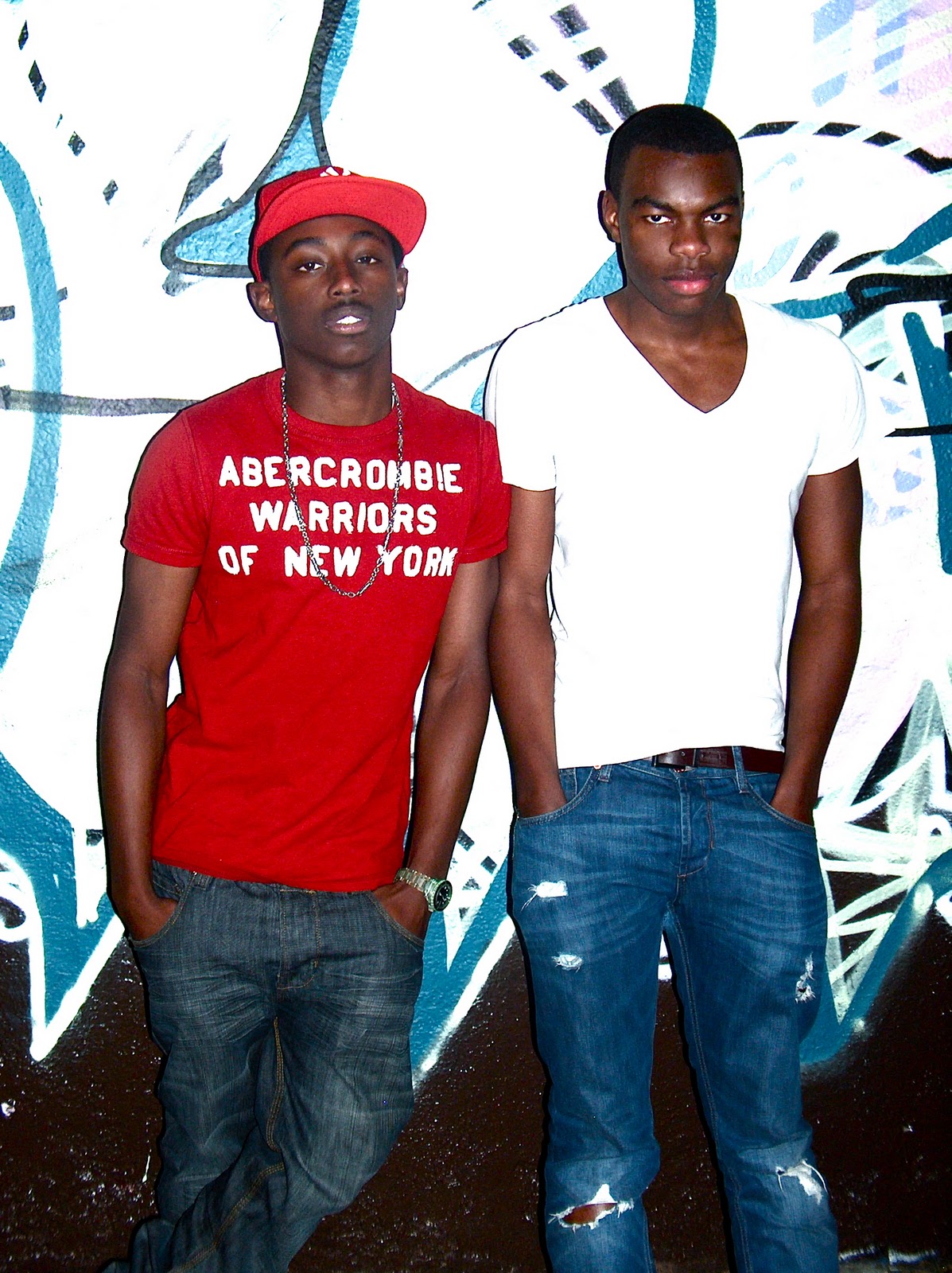
SWAG readers like to look good and dress well; they are more likely to buy clothes for style rather than comfort and agree with the statements 'I spend a lot on clothes' and 'I wear designer clothes'.

1 in 3 readers agree that they like to keep up with the latest fashion and over half of them feel it is important to look well dressed. 

Popular destinations include London and other big cities; visits include trips to their best nightclubs, restaurants and shops. 

SWAG readers are more than twice as likely as the average adult to eat out in a restaurant once a week or more. 

SWAG readers have a keen interest in new technology and like to keep up with the latest developments. 

They are more likely than the average adult to own the latest items, such as MP3 players, laptops, and a raft of wireless technology which they are never without in order to ensure they are readily available to update their Twitter, Facebook and BBM statuses.

They're some of the biggest downloaders of music in the UK. The majority of SWAG readers are between 18 and 24 - 62% male, 38% female - and they tend to be urban and single. 

They have a high disposable income and a high propensity to spend it on downloading tunes and buying the latest albums, clothes, nights out and buying the latest MP3 players and iPods, phones and computers and laptops.

Nearly 60% of readers do not read any other magazines, very few read books and they spend little time watching TV, especially at weekends.


Here are a few links to websites SWAG readers would be interested in:

Brand Profile

SWAG Magazine

SWAG has become a truly unique multi-platform media proposition. Across the magazine, swagmag.com, twitter.com/swagmag, SWAGTV, SWAGRadio and the brand's live events and awards, SWAG reaches over 50,000 music fans every month. SWAG is one of the most respected hip-hop and R&B music magazines in the world. Every month it gives its readers the most exciting, most authoritative coverage of the very best in hip-hop and R&B music, including award winning features, the latest releases, live reviews and a definitive guide to the best new artists.

Tuesday 14 September 2010

Planning and Research

Firstly I must research a few established and popular magazines to find out more about the codes and conventions that I will have to consider when producing my own magazine.
The magazines I have chosen to research are XXL, Vibe and Q.
XXL and Vibe are both very genre specific whereas Q provides a more eclectic selection of features.
I will take a closer look at and analyse all three magazines' front cover, contents page and double pages spreads as these are the features I will later on create.

(please click on the links below to visit the magazine's official website)